Intelligent digital marketing in Hampshire, UK for growing businesses

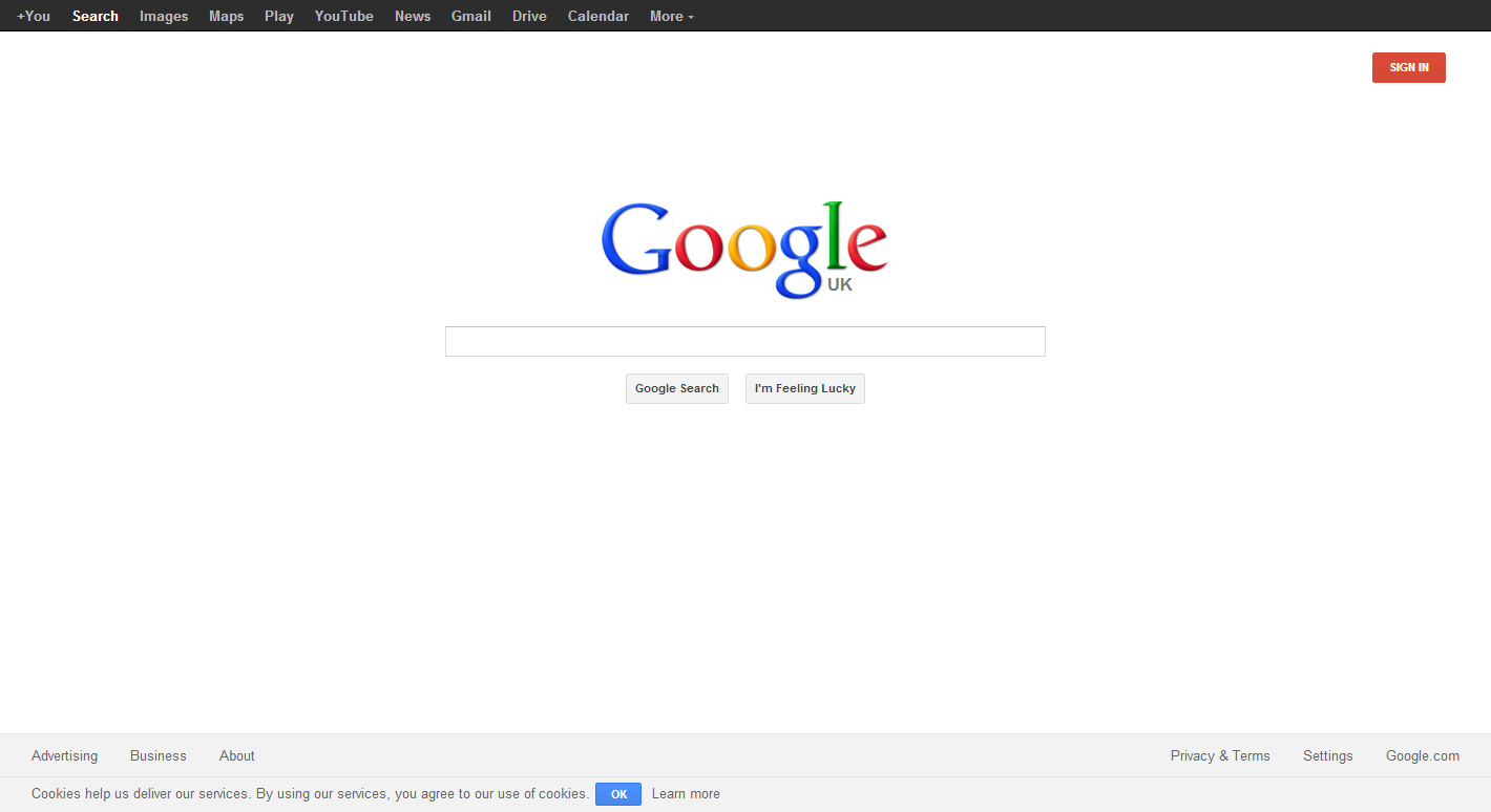
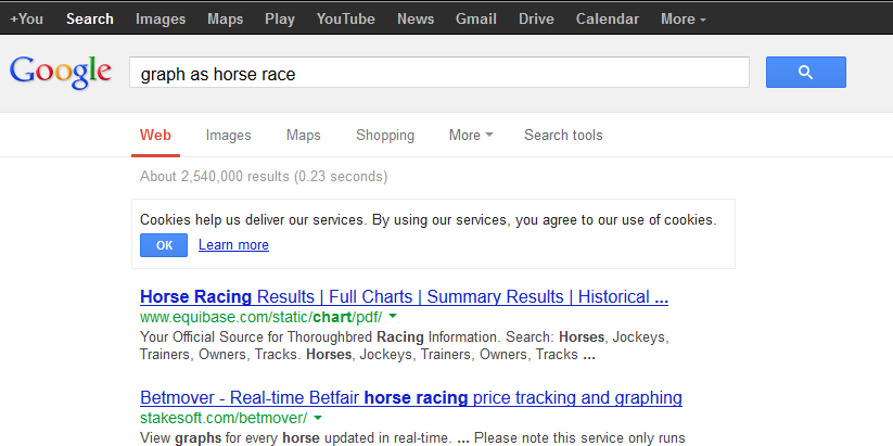
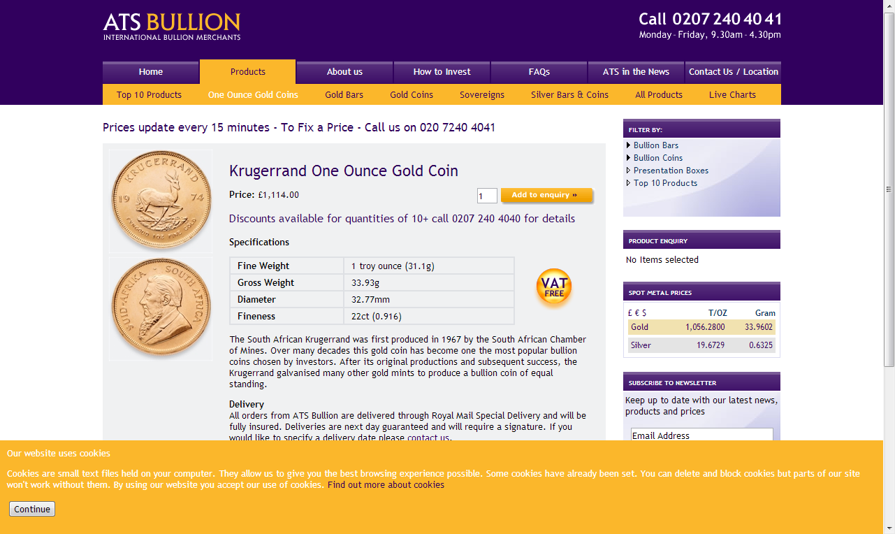
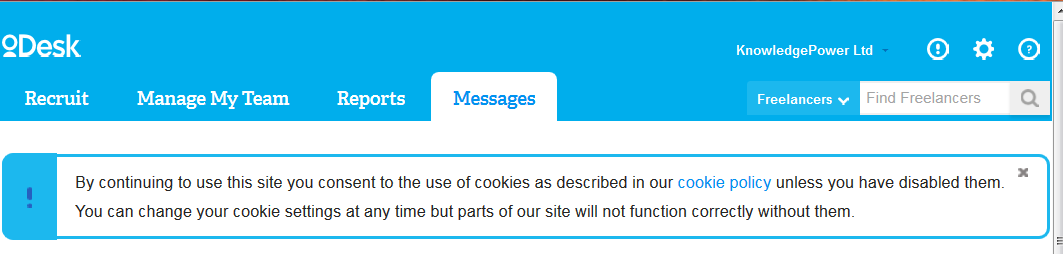
Cookie warning implementation examples

The EU requirements about every site having to bug users with warnings about cookies are annoying, but unavoidable. Exactly what to do is not laid down as a black and white rule. There are lots of different interpretations about how to present the alert / warning / notification to users.
Out of research interest we've gathered a few examples of different websites' approach to abiding by the regulations.

Here is the cool and clear cookie message in the footer of Google.co.uk. Probably most websites would not be far wrong just to copy this entire alert text and also button/link design & text approach. From an ethical point of view "help us deliver our services" delivers a fairly strong "f-you, you don't need to understand, just let big G get on with it, we'll do what we like and you need us anyway" but as that is pretty much what everyone already agrees when using Google, yeah, OK.
When jumping directly into search, you get the same warning stuck at the top of the search results, which at least is a valuable bit of screen real estate dedicated to the message.
This was an early one from "Which?" Magazine in 2012, adding a very clear and sizeable 'interruption' banner above the header navigation of the site. The ugliness is partly improved by including the logo at the top left, which helps explain that it is an official message and not just an error or an advert. The "Accept and Hide" seems like a good bit of text.
Below is the current "Which?" header at end of 2014:
The new design is obviously less ugly, replacing "warning red" with "cool blue" for the Accept button.
At the other end of the page, this is the cookie message from FreelanceAdvisor.co.uk. On the one hand, it's hidden at the bottom left (of the viewport), but it has a shouty headline and clear text. The "X" to close equates to "dismiss" rather than "agree".
The ATS Bullion cookie warning overlays the content and therefore clearly annoys enough to require response, even though the color scheme may make it appear part of the normal template. The button is "Continue" though, which is hardly the same as "accept" or even "dismiss": "dismiss" at least suggests having read what you are dismissing. The small, white on yellow text, with no header typography and full-page-width lines makes this warning difficult to read even if you want to. Furthermore, the "find out more" link is not styled clearly as a link. Overall this is not a very good implementation, neither clearly in-your-face nor discreet.
This UK Trade & Investment header message is clear enough, right at the top above the template header. However, as there is no way to dismiss it or "agree", it's clearly on the side of "notification" rather than "opt in". I don't think this is what the rules say actually. Anyway, the text of the message is pretty vague, weirdly mixing 3rd person and 2nd person (UKTI / we/our), and it is also a tiny bit annoying having 'Cookie Policy' in fright quotes. A bit more "creativity" with this message would have been "great".
Monster.co.uk recruitment site. The typography and decision to go for a "dismiss" rather than "agree" seem clear enough, although the "x" and the link are not that easy to click, let alone tap. The text is a bit weird, using present continuous "is using" seemingly written by an Eastern European programmer rather than native English speaker. We also see this strange mixture of third/second person "Monster is.. we use".
"We try harder" crowdfunding platform Indiegogo goes for a full dim-page, pop-over dialog box. They've opted for "notification" rather than "accept", but as an attention-grabbing alert that you have to take action to get past, it's done pretty well and the design works well both as an interrupter and matching the site styles.
The ODesk message is below the header but above the content. I actually prefer this as it is less jarring and can integrate with the site's normal message/alert styling, which imho makes it more likely that people will read it as a message rather than ignore like an ad or kill like a popup. The small "x" to close the message is pretty annoying though: a larger button with some kind of "accept" / "dismiss" wording would be preferable.
Cool refurbished PC ecommerce seller Tier 1 Online has a pretty ugly warning overlaying their header. The dodgy vertical alignment of the "i", the text, and the button, plus the weirdly descriptive-without-explaining-anything cookie text... could all be improved simply by copying one of the better approaches such as Google or Indiegogo.
I didn't note where this screenshot comes from, but the "No problem" acceptance button seems like a good way to combine acceptance with dismiss!
Another one where I can't recall where it's from, but this is an unusual example of actually asking the user to leave your page and go and look at some kind of "cookie preferences" dashboard. A brave and probably flawed effort to put power back in the user's hands, and helps explain why everyone is going just for the "accept", "dismiss", "close notification", or even "one time notify" route.
As we might expect, the MSN (2013) implementation was pure horror. That weird, clippy-esque yellow box is the cookie warning: probably the header was already too full of garbage to put it there..?
The current (2014) implementation is better, moved to a footer overlay. The use of a small "!" alert symbol seems good. Actually saying what cookies are going to be used for, i.e. "analytics, personalised content and ads" without dumbing down the terminology is admirable. Putting "learn more" as a much easier click/tap and visually more prominent than the small "X" (denoting what exactly...) is definitely the wrong choice, unless they are super motivated to have everyone read their entire privacy statement page - 2000+words and includes a further 13 "learn more" links. That privacy small print hub is well designed but you don't actually want any users to bother going there... Clicking "LEARN MORE" opens a new window/tab and doesn't even close the original warning message, grrr.

Summary: Choose whether you are going to get your users to "Agree" to something or just "Dismiss" a notification. Providing a button to make the notice go away is probably the best way to help touchscreen users. Watch the wording to try to keep it polite, non-patronizing, and not verbose. Avoid channelling traffic off to "learn more" policy type pages unnecessarily. How prominent to make the message is probably determined by your site's actual use of cookies and, ethically speaking, how important you believe it is to put it in users' faces. Apparently a lot of sites still go without warnings at all, or the notification is passive and hidden away, and apparently nobody really sees anything wrong with that.